Have you ever wondered why some rooms immediately captivate you, while others inexplicably make you feel uncomfortable? The answer may literally be right before your eyes – in the colors that adorn the walls, furniture, and details of a room. Welcome to the world of color psychology in interior design, a fascinating journey that goes far beyond the obvious, as the seemingly magical effect of colors on our emotions and perception is a phenomenon deeply rooted in the human psyche.
Emotions and Moods in the Spectrum of Colors
Colors are like a universal language that speaks to our emotions without words. A radiant yellow can evoke joy, a deep blue can convey calmness and peace, while a vibrant red can fill us with energy and passion. This emotional connection to colors goes far beyond aesthetic value and has a direct impact on our well-being. When we understand the power of colors over our moods and emotions, we can deliberately design spaces that engage our senses and enrich our experiences.

Basic Color Theory
The color wheel is a concept that shows the various shades we can see. In its main categories, we find the primary colors: Blue, Red, and Yellow. These colors cannot be mixed from other colors but form the basis for all other colors. By mixing primary colors, secondary colors like Orange, Green, and Violet are created. Tertiary colors, in turn, are created by mixing primary and secondary colors.
The Effect of Different Colors
Explore the different colors and their impact on the space by clicking on the respective color.
Blue
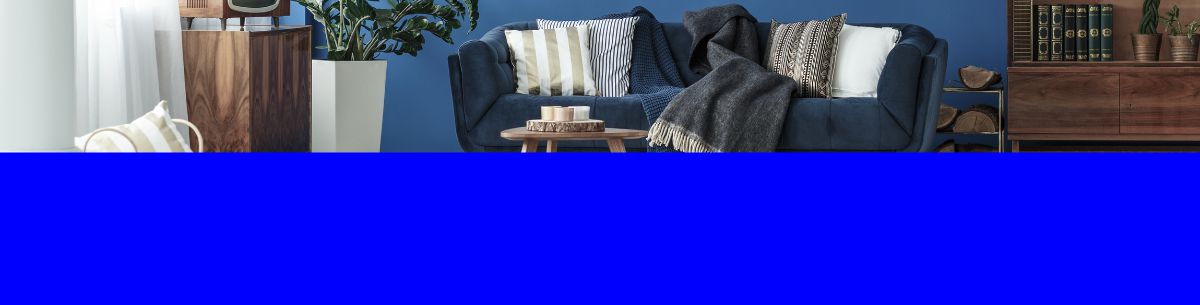
Blue is a color often associated with calm, peace, and serenity. Studies have shown that blue is perceived as soothing, as it establishes a connection to the vastness of the sky and the sea. A study from the University of Sussex confirms that blue is suitable for calming the mind and reducing stress. It can trigger a physical response that lowers heart rate and promotes relaxation.
-
Blue in the Bedroom: An Oasis of Calm In bedrooms, blue can unfold its full calming power. This makes it an ideal choice for bedrooms as it can help create a peaceful environment conducive to restful sleep. Whether in the form of wall colors, bedding, or decorations – a gentle blue can create an oasis of tranquility and relaxation.

- Blue in the Workspace: Promoting Concentration and Creativity Blue can also play an important role in workspaces. While too much blue in such spaces might be overly calming, accents of blue can promote concentration and creativity. The calming effect of blue can free the mind from distractions, which is conducive to deep thinking and creative ideas. This makes blue an excellent choice for creative workspaces where innovative solutions are needed.

- Blue in the Bathroom: Freshness and Relaxation Blue can also have a refreshing effect in the bathroom. The color evokes the clear water of lakes and oceans and can convey a sense of cleanliness and freshness. In a bathroom, blue can create a relaxing environment perfect for soothing baths or a break from everyday life. The color blue is extremely versatile and, depending on the shade and intensity, can evoke various moods. In any room, whether it's a bedroom, workspace, or bathroom, blue can be used deliberately to create the desired atmosphere and meet the needs of the space and its users.

Red
Red is the color of passion and energy. Studies have shown that red can increase heart rate and create a feeling of excitement. In spaces where activity and energy are desired, red can be a good choice.
- Red in the Kitchen and Dining Area: Stimulating Appetite In the kitchen and dining area, red plays an exciting role. The color red is known for stimulating appetite and increasing energy levels. Studies have shown that the presence of red in the environment can lead people to eat faster and more. Therefore, adding red accents or elements in the kitchen and dining area can create an inviting and social atmosphere. Think of red chairs, tablecloths, or even red accessories.
- Red in Workspaces: Increasing Attention and Activity In work areas, the color red can help increase attention and, therefore, promote activity. Intense red stimulates the mind and boosts energy. This is beneficial in environments where creative ideas need to be developed or high concentration is required. A red accent on the wall or red decorations can help liven up the workspace.
- Red in Common Areas: Inviting Energy In common areas like the living room or hallway, red is very inviting and promotes a feeling of warmth and togetherness. A red sofa, pillows, or artwork can brighten up the space and create a friendly atmosphere. However, remember to control the intensity of the red to avoid an overwhelming effect.

Yellow
Yellow is the color of creativity and optimism. Studies have shown that yellow is associated with enhanced creativity and cognitive performance. Spaces that foster creativity benefit from yellow accents.
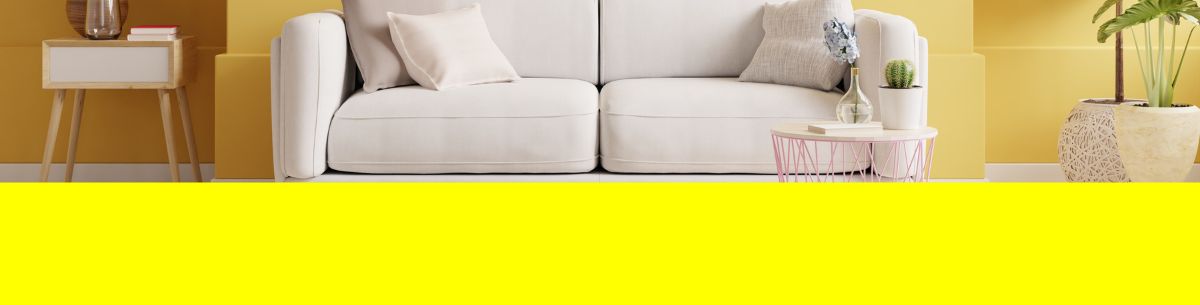
- Yellow in Kitchen and Dining Area: Inviting Warmth Yellow is an inviting color that creates a warm and welcoming atmosphere in kitchens and dining areas. It evokes thoughts of the sun and radiates positive moods. In the kitchen, yellow can brighten up the space and create a friendly environment for meal preparation and communal dining. Yellow walls, curtains, or even tableware can fill the space with energetic warmth.
Orange

The psychological effect of orange is also interesting. Orange is often associated with joy, energy, and enthusiasm. According to a study, the color orange can evoke a positive perception of attractiveness. It is perceived as dynamic and inviting, making it a versatile choice for different spaces.
- Orange in the kitchen and dining area: Sociability Orange is a sociable color that creates a welcoming atmosphere in kitchens and dining areas. It evokes feelings of coziness and community. In the kitchen, orange can create an energetic mood and increase appetite. Studies, such as those by Satyendra Singh ["Impact of Color on Marketing"], have shown that orange can stimulate appetite. Orange accents in the kitchen, whether in the form of decorations or tableware, liven up the space and create a pleasant atmosphere for shared meals.

- Orange in living spaces: Pure joy in living and communal areas, orange creates a warm and inviting atmosphere. The color exudes joy and energy, revitalizing the space. Orange accents like cushions, curtains, or decorations can brighten up a room and create a positive atmosphere. Remember to balance orange with neutral colors or other warm tones to ensure a harmonious design.

Green
The psychological effect of green is fascinating. Green is often associated with positive emotions such as calmness, hope, and balance. According to a study, green can have a calming and refreshing effect. Due to its association with nature, green has a connection to positive emotions and thus has a positive impact on mood in general.
- Green in the bedroom: Soothing naturalness In bedrooms, green can fully express its soothing effect. The color brings to mind the forest or a bed of grass and is often associated with relaxation and peace. A gentle green on the walls, bedding, or in decorative objects can create a natural and calming environment conducive to restful sleep.
- Green in workspaces: Focus and balance Green can also play an important role in workspaces. The color promotes concentration and balance. Green is often associated with renewal and growth, which can enhance productivity and well-being. A green accent on the wall or green elements in the decor create a pleasant work environment that stimulates thinking and reduces stress.


Purple
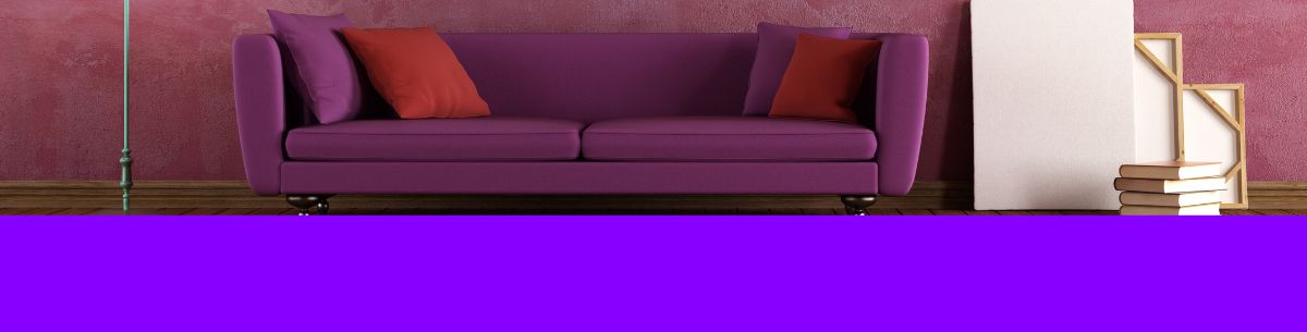
The psychological effect of purple is fascinating. Purple is often associated with creativity, spirituality, and luxury. As a research paper shows, purple can be perceived as appealing and establish a connection to sophisticated emotions. It can convey a sense of sophistication and uniqueness.
- Purple in the bedroom: Elegant relaxation In bedrooms, purple creates an elegant and soothing atmosphere. A soft purple on the walls, as bedding, or in decoration can create a luxurious environment ideal for rest and relaxation.


- Purple in the living room: Refined elegance In living and communal areas, purple can create a refined yet inviting mood. The color exudes elegance and can fill the room with a mysterious aura. Purple accents like cushions, curtains, or artworks can enhance the room and create an atmospheric depth. However, it is important to use purple sparingly to avoid an overwhelming effect.
Which Room Color Should You Choose?
Criteria for Choosing the Right Color
Choosing the right color for a room is a decision of great importance, as colors can have a profound effect on the mood, atmosphere, and well-being of the occupants. Various criteria should be considered when selecting a color to ensure the desired impact is achieved. Here are some important aspects to consider when deciding on a color:
1. Room Function: The function of the room is crucial for color selection. A bedroom focused on relaxation may benefit from soothing colors like blue or green. A workspace might benefit from more stimulating colors like red or green to boost productivity.
2. Occupants and Preferences: The preferences of the room's occupants should also be taken into account. A room used by children can be enlivened with vibrant colors like yellow or green, while adult users may prefer a more subtle palette.
3. Room Size and Lighting Conditions: The size of the room and the available natural lighting are important factors in choosing the right color.
Enlarging Small Spaces: In small rooms, light colors like white, pastels, or soft shades of yellow and blue can work wonders. Light colors reflect light better and create the illusion of more space and openness. By distributing light, they make the room feel airier and more spacious. Light colors can make the boundaries of the room disappear, creating a pleasant and open environment.
Diminishing Large Spaces: In large rooms, darker and more intense colors can be used to create a cozier atmosphere and visually shrink the space. Deep blue, dark green, or warm earth tones can make large rooms feel more inviting by creating a sense of intimacy. These colors can visually contract the space and imbue it with a cozy atmosphere.
4. Color Contrast and Harmony: Choosing contrasting colors or harmonious color schemes can influence the visual impact of a room.
Color contrasts occur when colors stand out to different degrees and contrast with each other. Strong contrast between colors can grab attention and create visual interest. Think of a classic black and white design or vibrant complementary colors that oppose each other, creating a strong contrast.
Color harmony, on the other hand, refers to how colors blend together to create a pleasant visual experience. Harmonious color combinations can have a calming effect and bring the room together. Concepts like analogous colors (colors adjacent on the color wheel) and triads (color groups evenly spaced on the color wheel) play a crucial role here.
5. Furniture and Decorations: The existing furniture and decorations in the room can influence color choice. It's important to consider whether the chosen color harmonizes with the existing elements or if adjustments need to be made.
Conclusion: The Art of Choosing Colors for Appealing Spaces
The impact of colors in interior design is a fascinating journey through emotions, moods, and personal perceptions. From warm tones that provide comfort to cool hues that promote calmness and focus, we have explored the palette of colors and understood their powerful role in interior design. In the art of color selection lies the opportunity to not only make spaces beautiful but also functional and meaningful.
_preview.webp)
_preview.webp)


